View

HABBA — A Brand Identity Crafted Around the Ritual of Coffee
Brand Identity / Food & Beverage
We created a warm, distinctive visual identity for HABBA, bringing its specialty coffee experience to life across every customer touchpoint — from the brandmark and packaging to printed materials and the physical space.
From a Coffee Concept to a Complete Brand Experience
HABBA needed more than a recognizable logo. It needed a flexible identity that could feel consistent on a coffee cup, a menu, stationery, staff uniforms, and within the café itself.
Our approach was to build one coherent visual system — distinctive enough to be remembered, flexible enough to work across different applications, and practical enough to support the brand as it grows.
One Identity. Many Touchpoints.
A specialty coffee brand is experienced through repeated details — the cup customers hold, the menu they read, the packaging they carry, and the space they remember.
The challenge was to create a visual identity that feels warm, refined, and recognizable while remaining functional across packaging, printed materials, digital communication, uniforms, and environmental branding.
Designed to Work at Every Scale
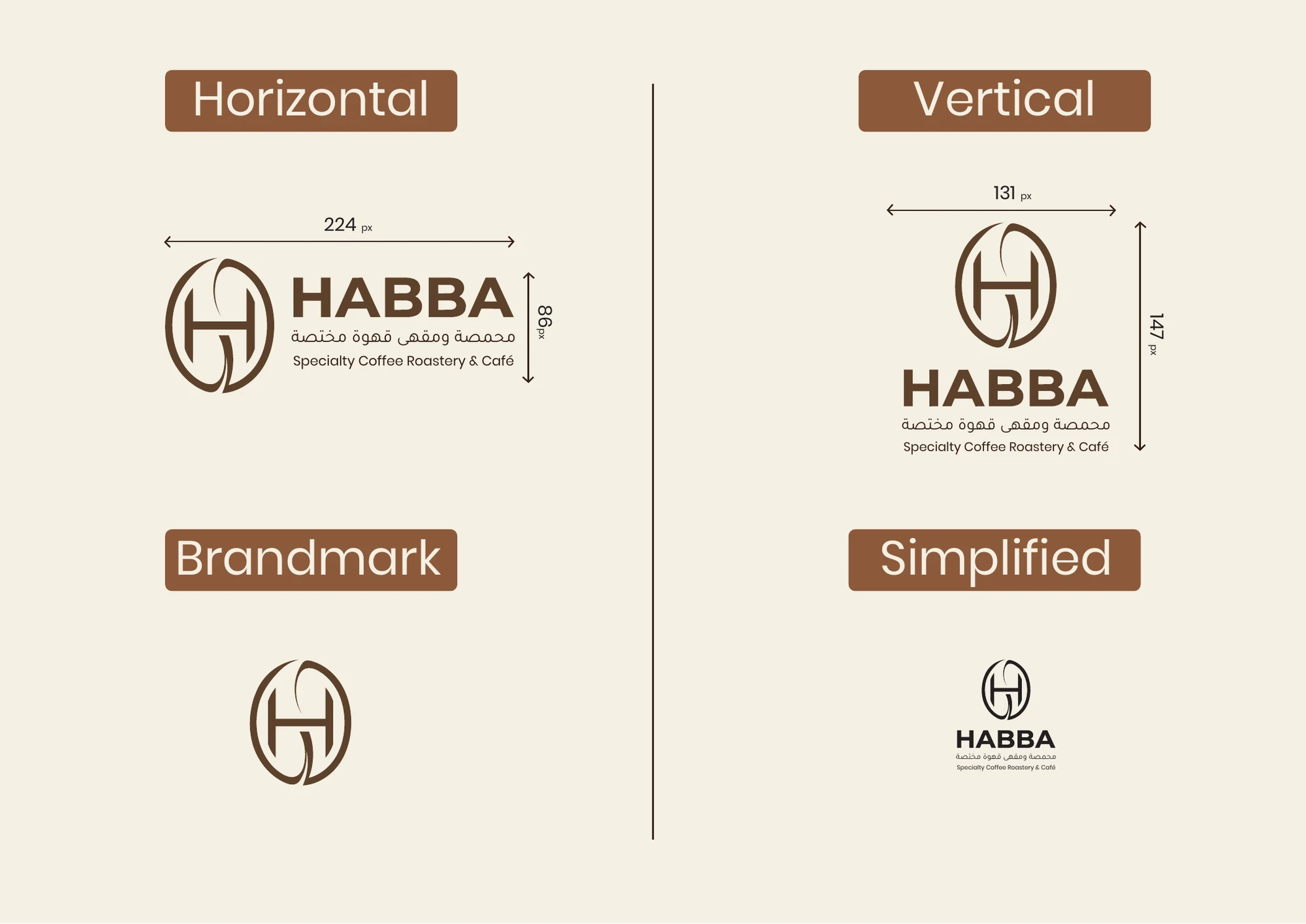
The HABBA identity is built around a distinctive H monogram inspired by the elegance and precision of specialty coffee culture.
A flexible family of horizontal, vertical, simplified, and standalone brandmark configurations allows the identity to remain clear and recognizable across large-format signage, packaging, printed materials, and small digital applications.
- Horizontal Logo
- Vertical Logo
- Standalone Brandmark
- Simplified Logo
A Palette Inspired by Warmth, Craft, and Character
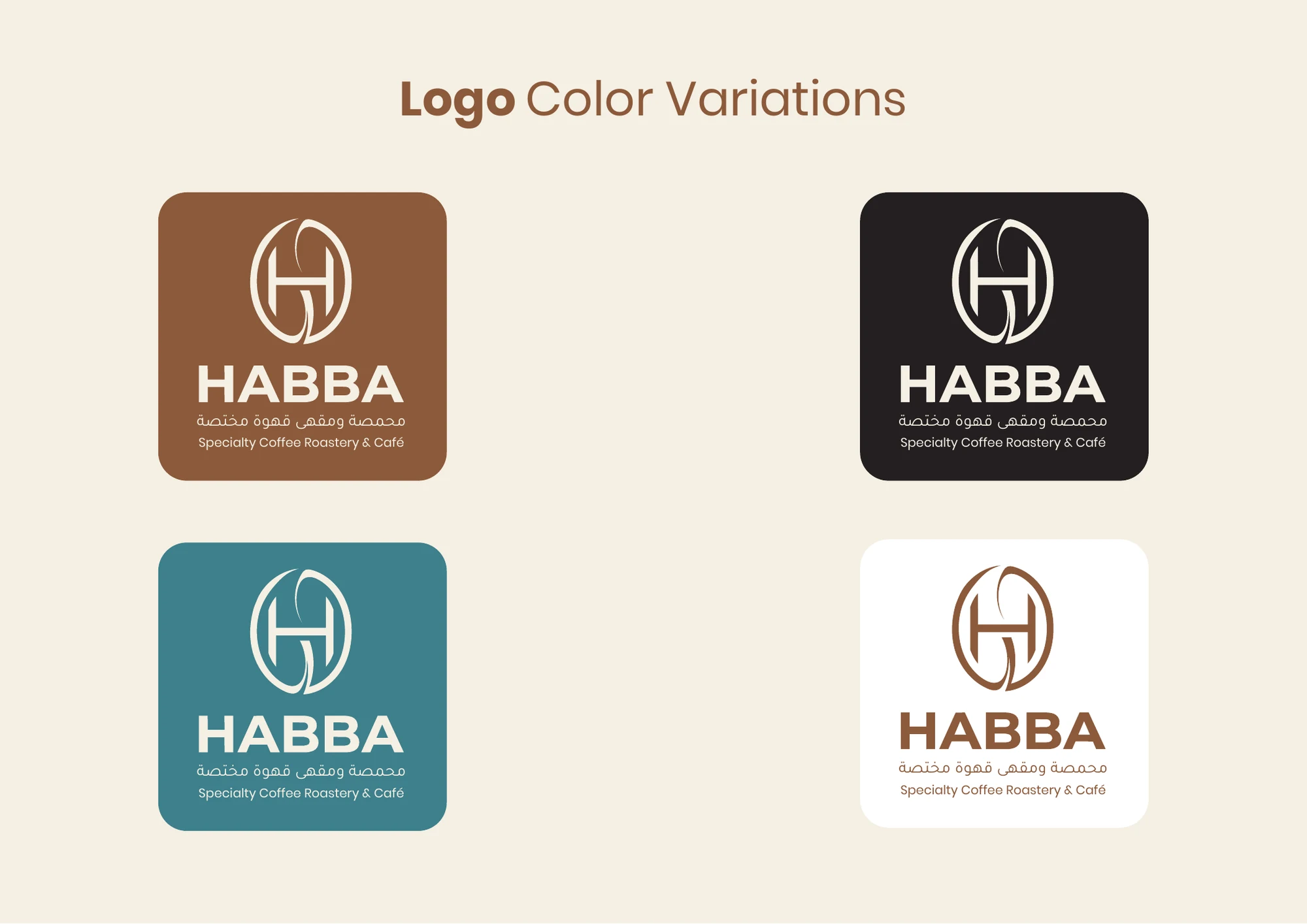
The color palette combines warm coffee-inspired brown with deep contrasting tones and a distinctive blue accent. Together, these colors give HABBA a refined yet approachable personality.
The system also includes light and dark logo variations, ensuring clarity and consistency across different backgrounds and applications.
Consistency Builds Recognition
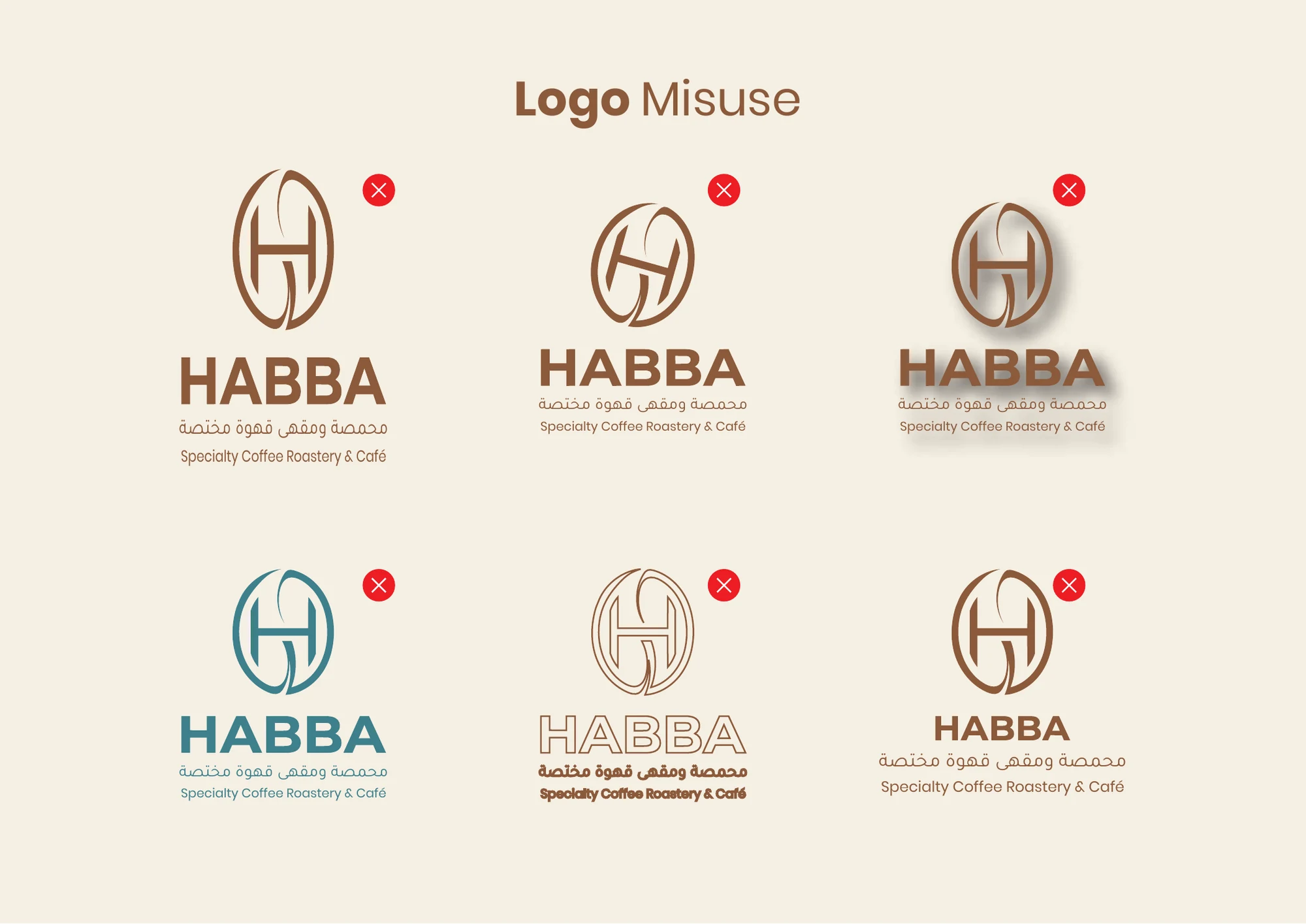
A strong identity depends on how consistently it is used. Clear logo guidelines were developed to protect the proportions, colors, spacing, and visual integrity of the HABBA brand.
These rules prevent incorrect stretching, rotation, effects, recoloring, and layout changes — helping the identity remain recognizable wherever it appears.
Bringing the Identity into Everyday Business
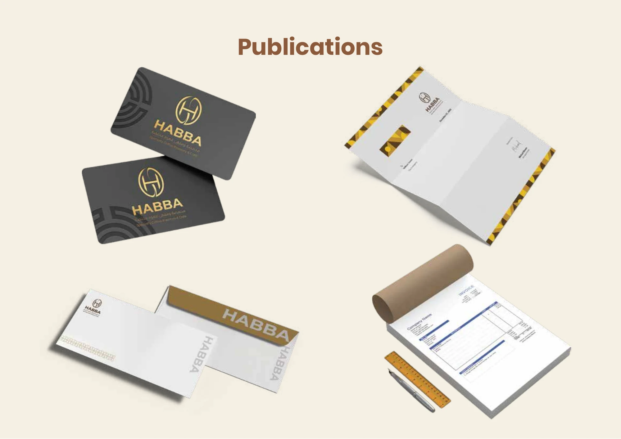
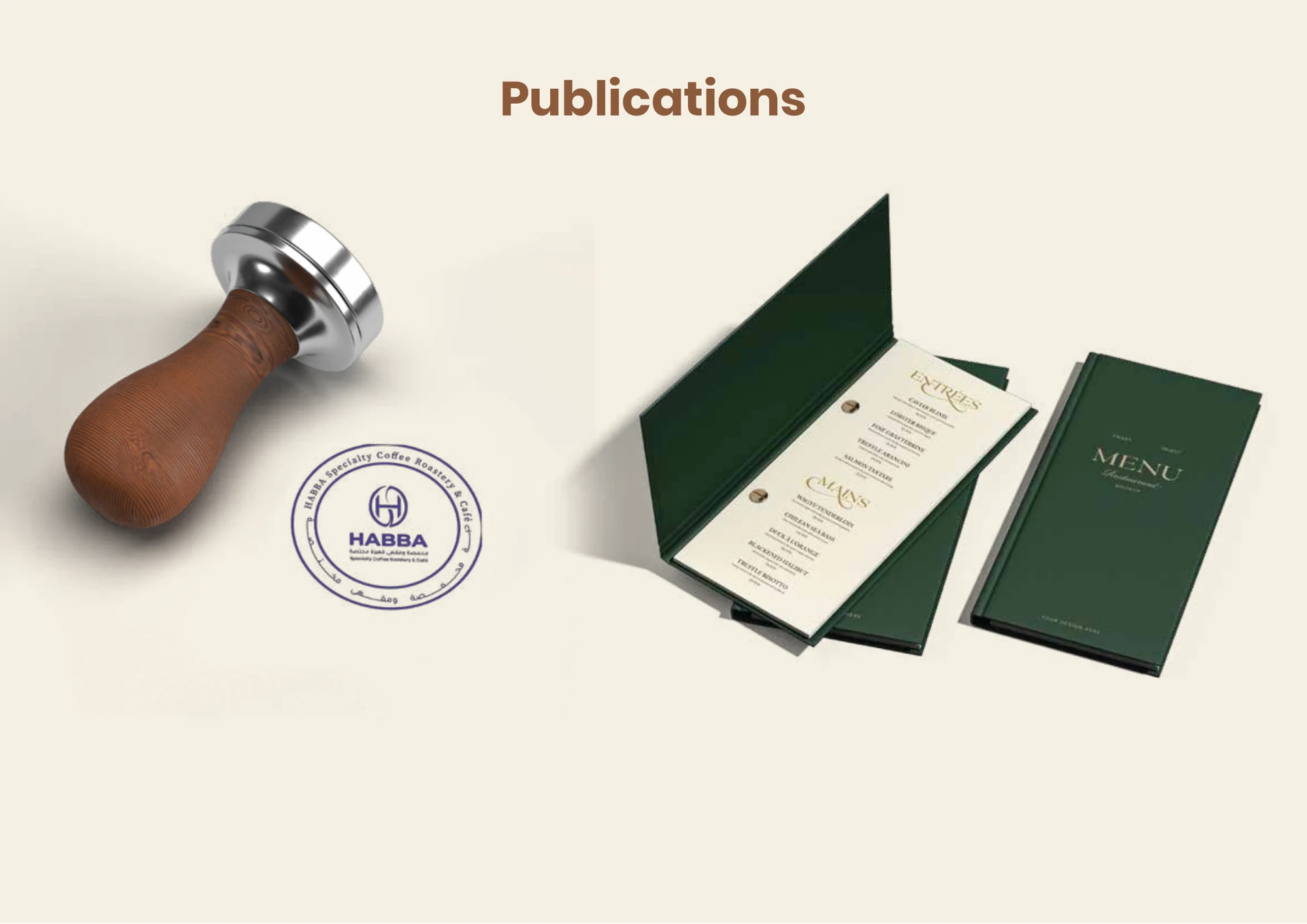
The identity was extended across the brand’s essential printed materials, creating a consistent and professional experience in both customer-facing and operational touchpoints.
From business cards and stationery to menus and branded stamps, every application follows the same visual language while adapting to its specific function.
Designed to Travel with the Customer
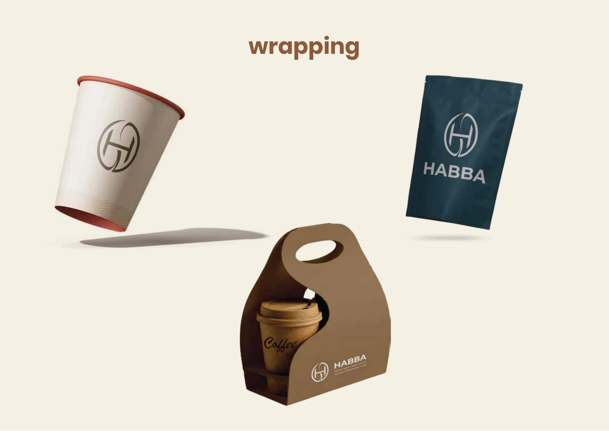
Packaging turns the brand into a physical experience customers can carry with them. HABBA’s visual identity was adapted across coffee cups, coffee bags, and takeaway carriers while maintaining clear recognition and a consistent premium character.
Each packaging application was designed to feel like a natural extension of the café experience — practical, memorable, and unmistakably HABBA.
From Visual Identity to Physical Experience
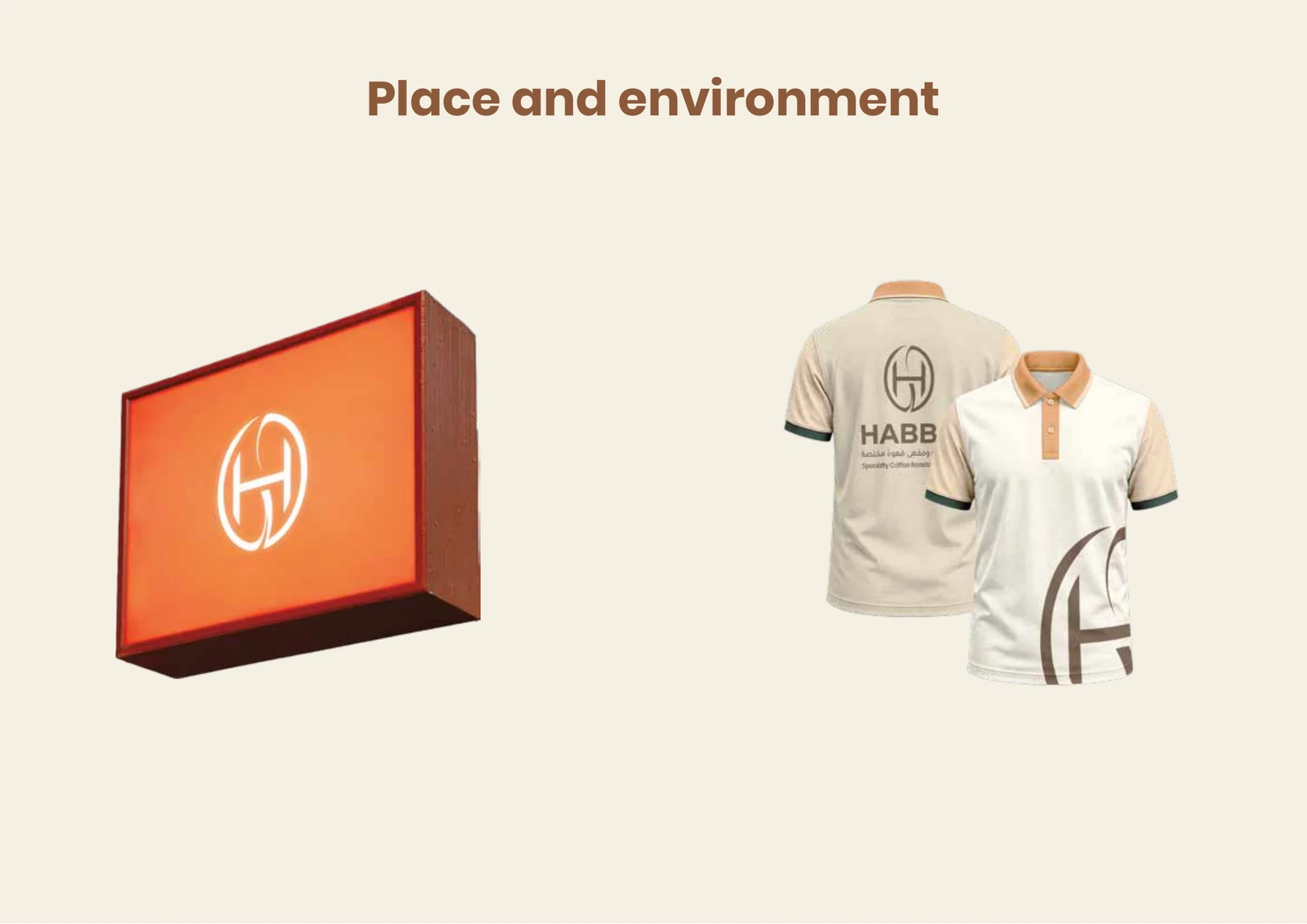
A complete brand identity should remain recognizable beyond printed materials. The HABBA system was extended into the physical environment through exterior signage and staff uniforms.
These applications help create a connected customer experience — from seeing the café for the first time to interacting with the team inside.
What We Delivered
- Brand Identity Direction
- Primary and Secondary Logo Configurations
- Standalone Brandmark
- Logo Usage Guidelines
- Brand Color System
- Business Stationery
- Menu and Printed Collateral
- Coffee Packaging
- Takeaway Packaging
- Staff Uniform Applications
- Environmental Signage
Your Brand Should Feel Complete at Every Touchpoint.
From the first idea to the final application, we build identities that are ready to be seen, remembered, and used.